BRAND STORY
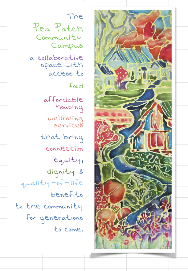
The Pea Patch Community Campus is a unified social services hub that connects Orcas Islanders with the food, shelter and wellbeing services they need to thrive – now and for generations to come.
The 11-acre campus features green spaces, walking paths and community benefits for the whole island. When basic human rights for housing and food are met, our entire community benefits.
The 11-acre campus features green spaces, walking paths and community benefits for the whole island. When basic human rights for housing and food are met, our entire community benefits.
Values
COLLABORATION
The project is a collaboration between OPAL Community Land Trust and the Orcas Island Food Bank, primarily. But also includes partnership with the Orcas Community Resource Center, Orcas Island Community Foundation, Island Rides, The Funhouse Commons, San Juan County and others as, later, stewardship plans for the green spaces are developed.
EQUITY, DIGNITY, INCLUSION
The buildings and access to campus are being designed to provide these basic human rights with dignity, equity and inclusion. Trauma-informed design, ADA accessibility, privacy for clients and renters, respect for surrounding neighbors and organizations are all prioritized.
ENVIRONMENTAL INTEGRITY
The building are all designed to a LEED silver standard and the site plan includes stormwater runoff systems that will protect local waterways and the Salish Sea, rain gardens, pervious surfaces, solar energy (built at construction with housing; solar-ready infrastructure for food bank) and native plant landscaping.
GENERATIONAL FORESIGHT
OPAL’s housing construction is built for long-term durability, affordability, energy efficiency and designed to encourage neighborhood harmony and cohesion. The Food Bank building is designed on a 75-year horizon to meet the needs as they evolve - including capacity for service disruptions, economic uncertainties and changing demographics.